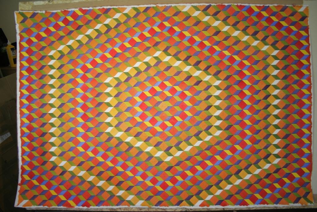
Epic Colour contrast
A quick insight into the construction of this 100 x 165 cm original watercolour.
It’s based on a cube constructed from a 5 cm grid.
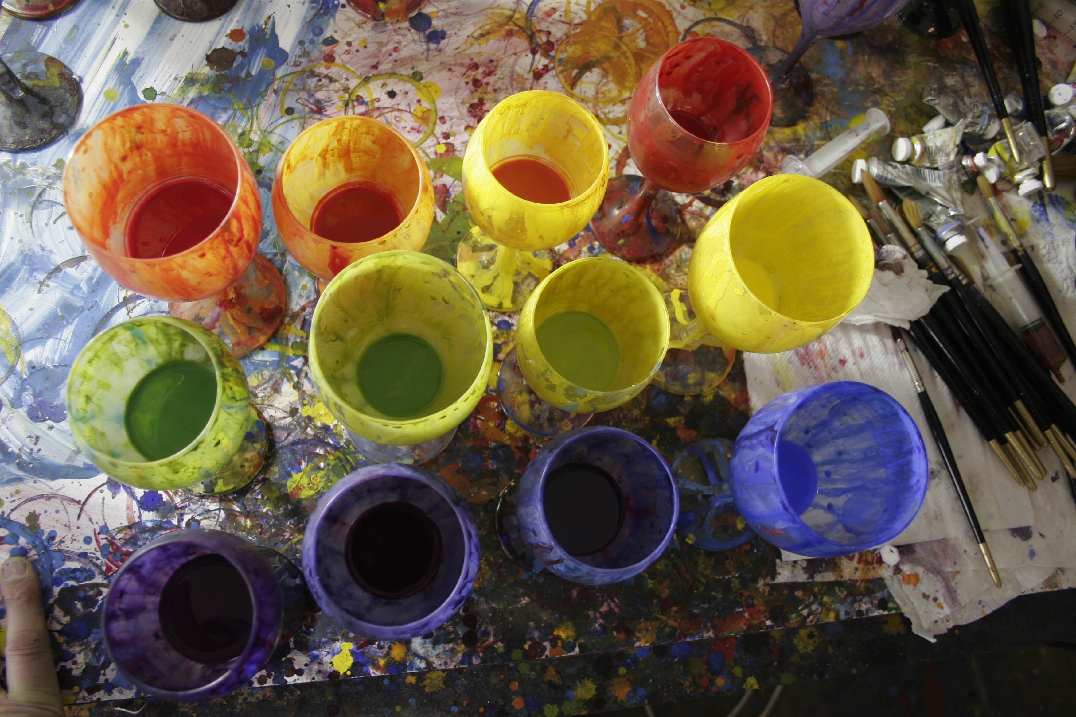
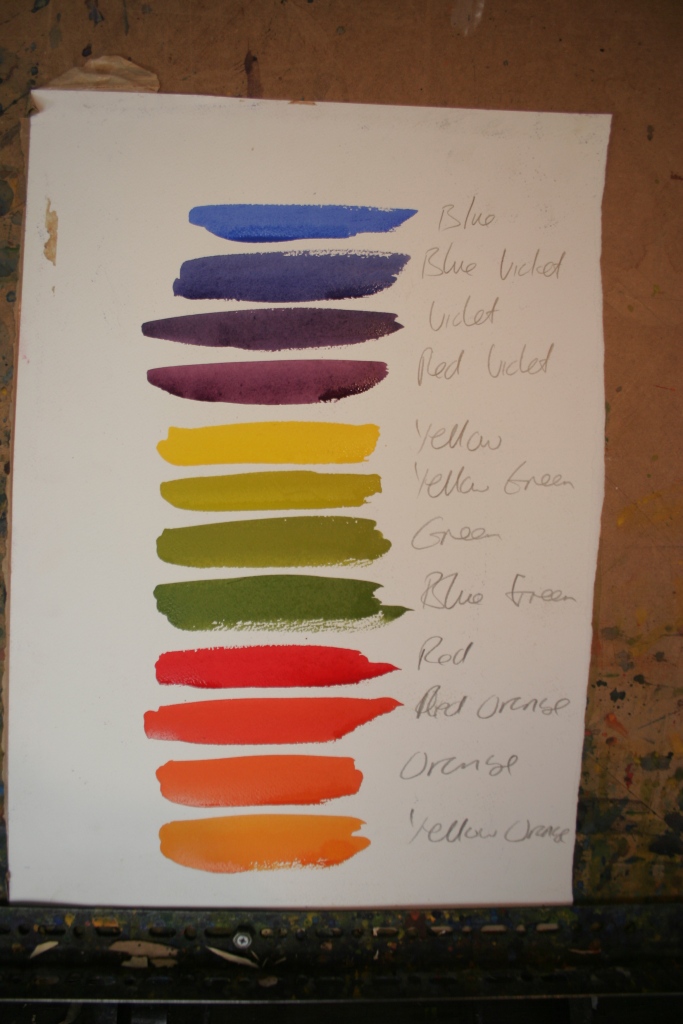
I’m using 12 colours essentially based on a simple 12 point colour wheel. Here they are mixed up in there glasses.
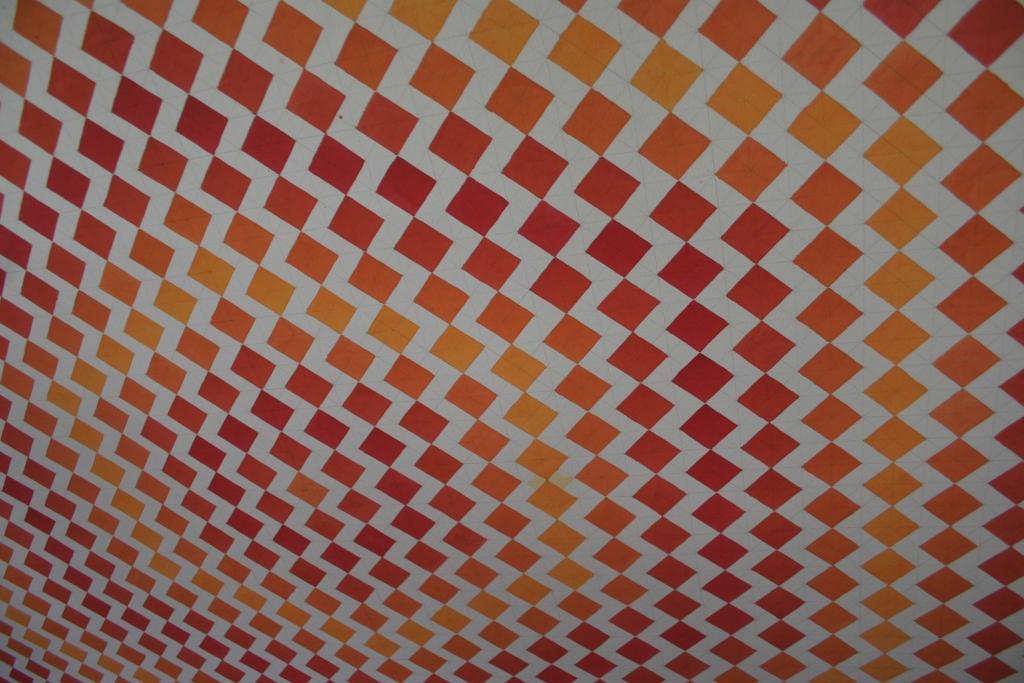
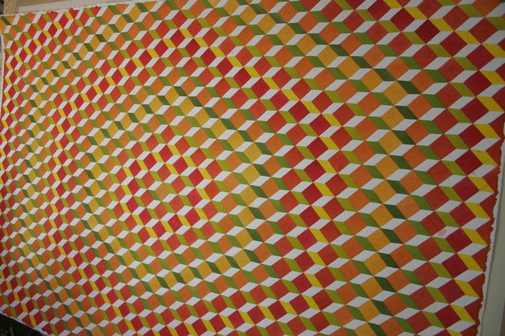
The entire piece is composed of 600 cubes. Below is the first application of colours based on red, red/orange, orange and yellow/orange. This initial stage covers 50% of the paper.

The dominant colour here is dark orange – 8 hexagons, then orange with 5, red with 4 and yellow orange with 2.

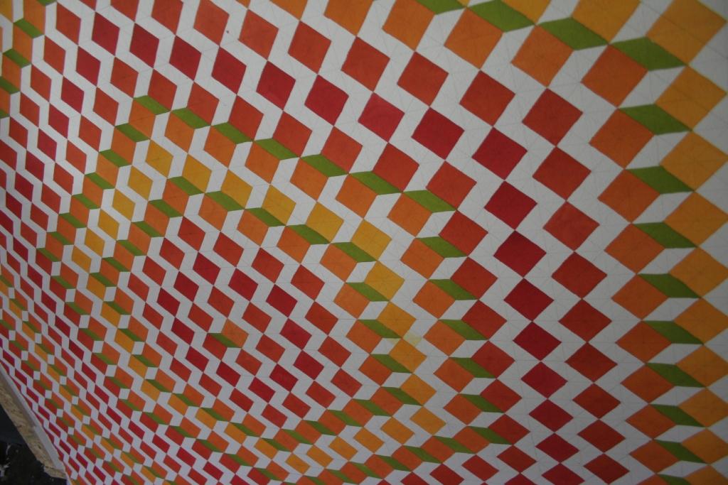
Here is the first application of green opposing the orange.
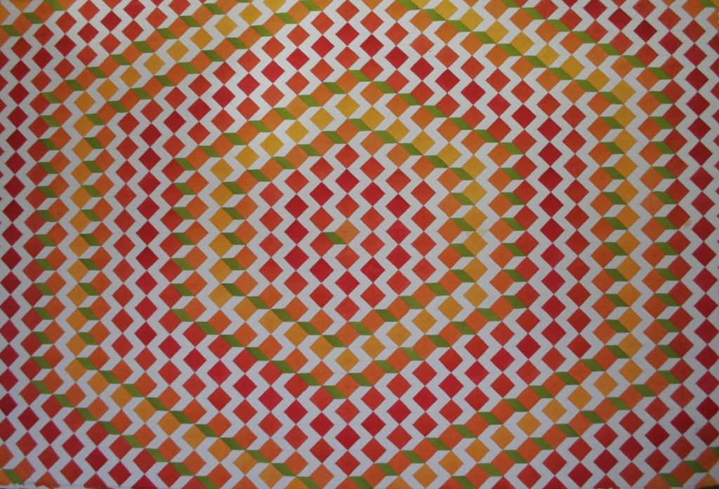
From an angle. each application at this stage covers only 7.5% of the paper
Below is the second application on the green spectrum yellow/green which opposes the red/orange.
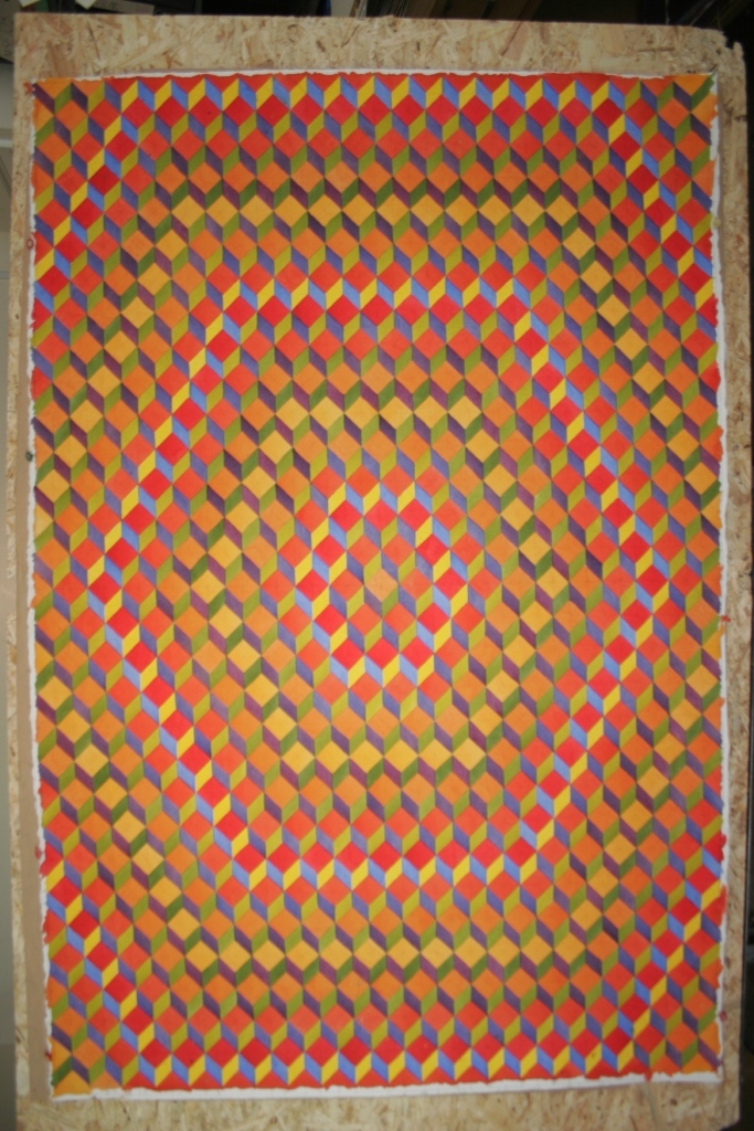
I maybe see this actually being presented in a portrait format. Below the pure yellow is on to join the red. The violet will eventually oppose this later.
A close up.

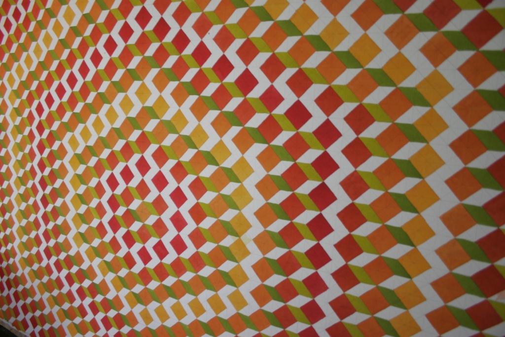
The 4th and final colour on the green spectrum is blue/green which opposes the yellow/orange.
At a different angle
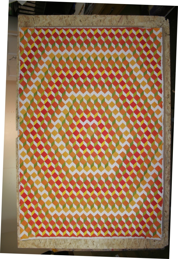
Next up is the final 4 colours in the blue/purple spectrum, first up was blue/violet to oppose the red/orange and yellow/green
Close up (I forgot to photograph the violet application separatly, so this is also on here)
So violet was the 10th application in total and opposes the orange and the green
2 to go

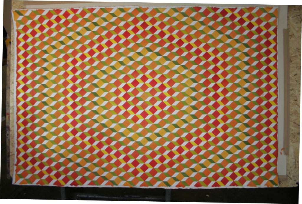
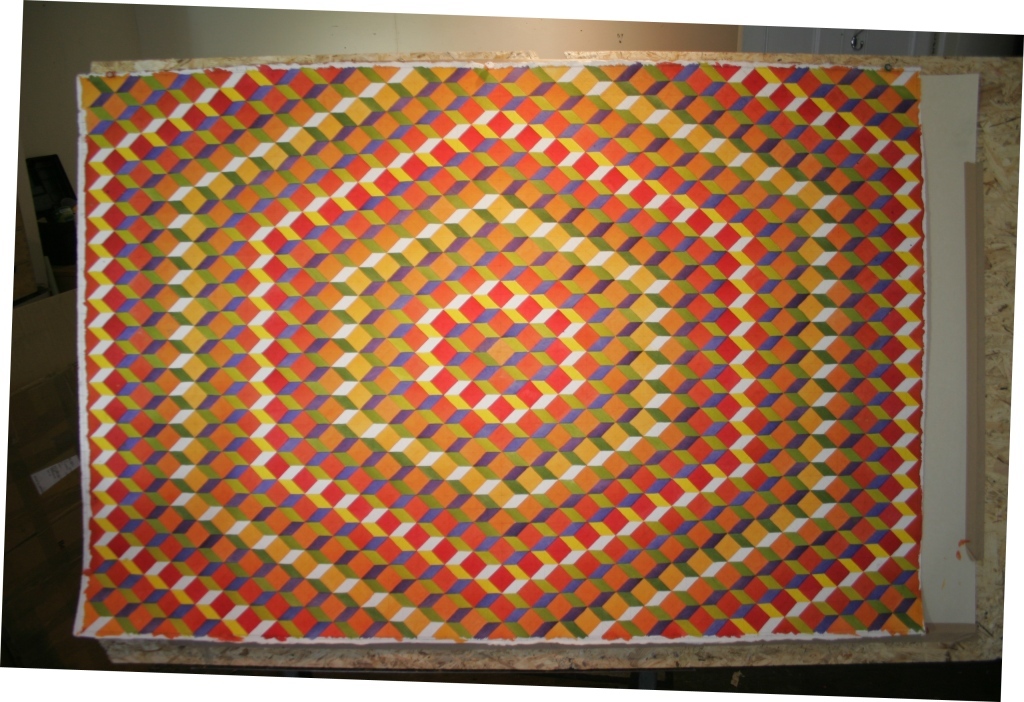
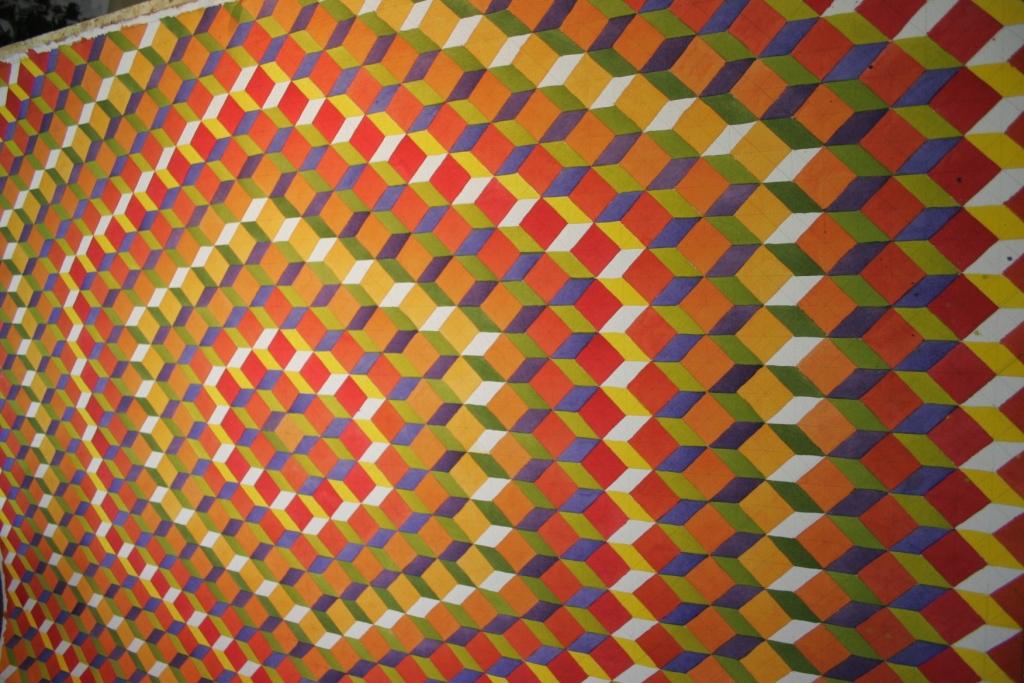
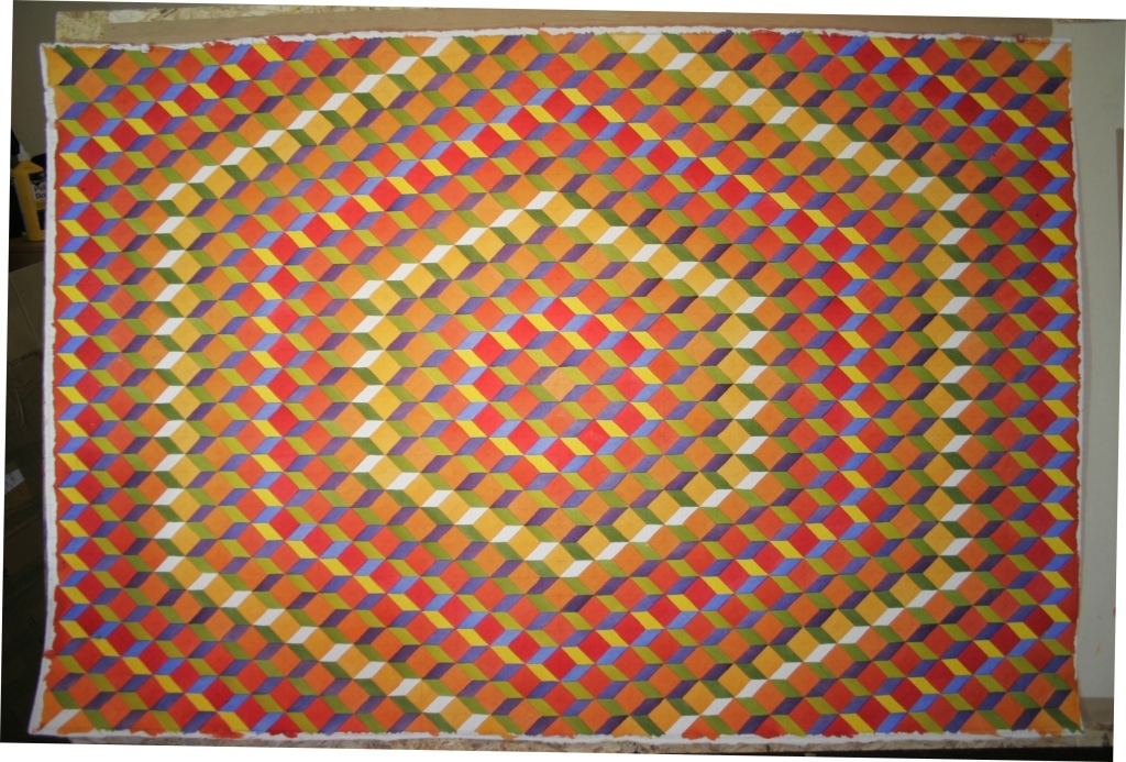
the penultimate application was the pure blue, so the red yellow and blue primary squares are also complete.
Finally to complete was the red/violet, so no white paper is left
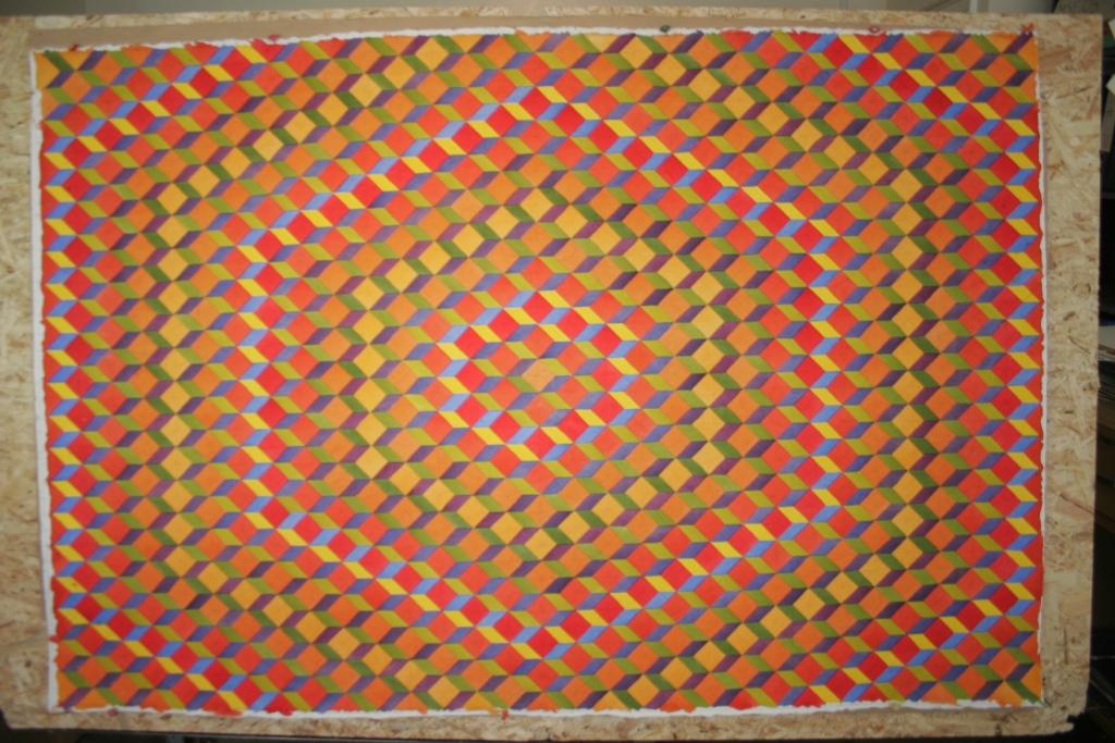
So 600 cubes, 1,800 separate shapes over 12 colours.
It took a while. I’m pleased. In reality the whole painting vibrates, pulses and moves. it really works.
Any questions either DM me on twitter or email me at info@mjforster.com email me at

