Colour Contrast June 2018
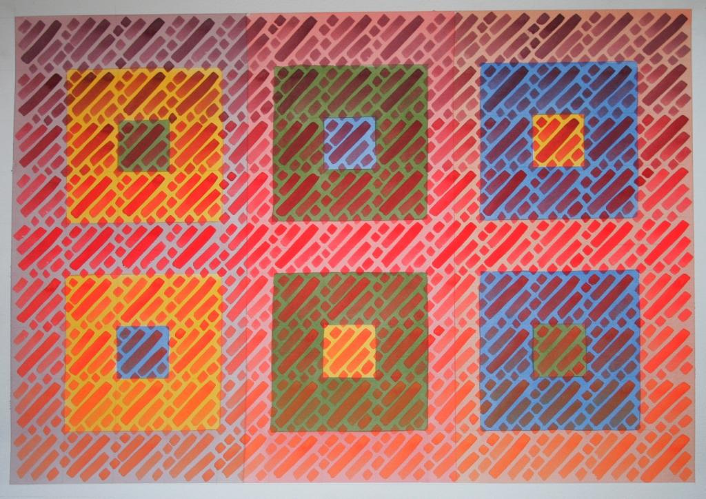
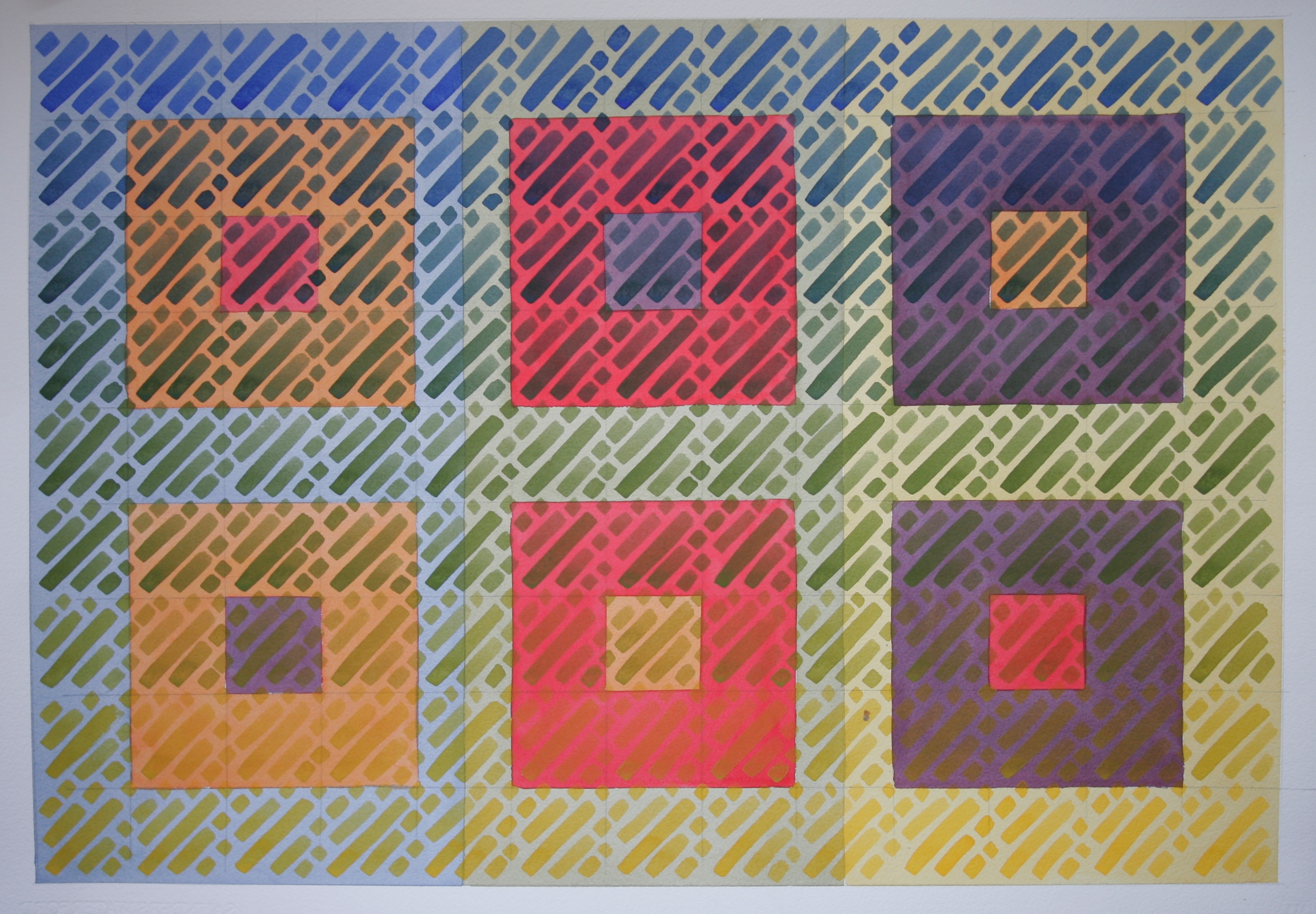
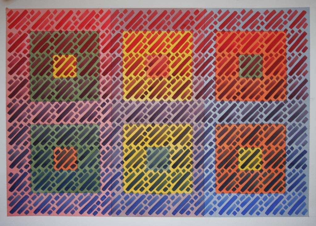
Here are a series of six colour studies painted in watercolour. Essentially they are a compacted representation of what can be achieved using a very primitive set of colour mixes revolving around the basic six primary and tertiary colours.
Although there are 6 paintings, in theory each square could be interpreted as a separate painting so perhaps 36 individual cubes may be an alternative way view them.
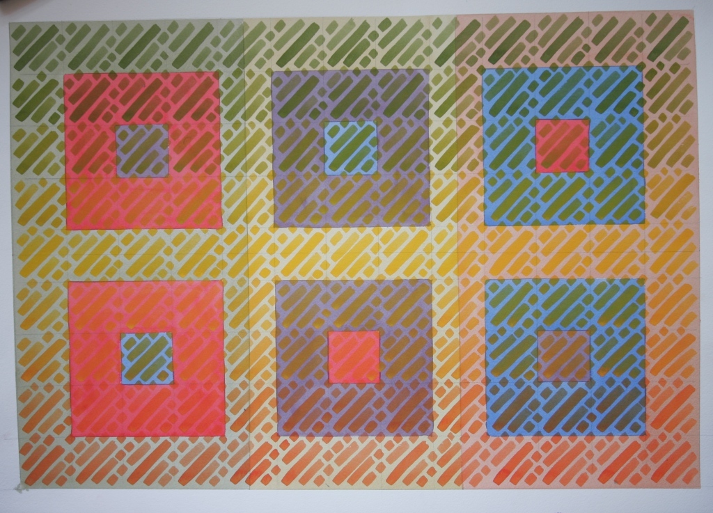
I have grouped each painting into three sets of squares. So below we have orange, red and purple moving clockwise around the colour wheel.
The initial wash behind each set of two squares directly reflects it’s colour opposite.
So for the painting below the two blue squares have an orange wash behind them. However this is a softer orange as I have have tinted it with blue, the yellow wash behind the purple with yellow and so on.
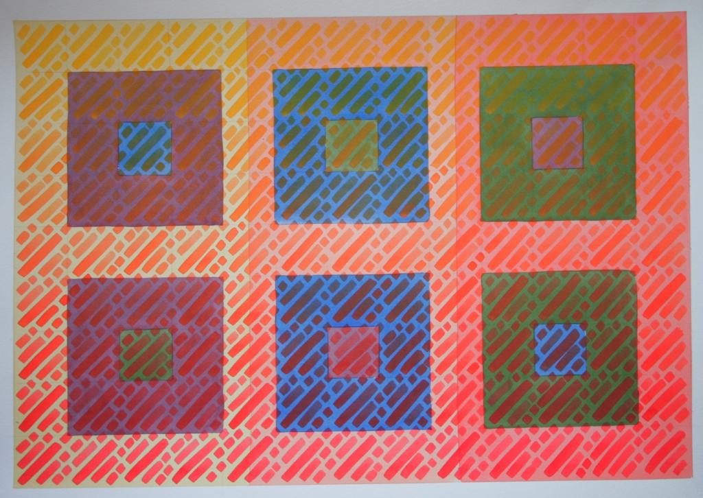
I did this to enhance the tonal contrast of the true nature of the colours reflected in the squares and stripes. So there is also an element of tonal contrast. There is a smaller colour within each large square to reflecting the six possible combinations of colour within each set.
The largest distance apart on the colour wheel is always reflected in the top right and bottom left combination of squares. They either a jump from primary to primary or tertiary to tertiary. The other four are a half way contrast.

In the painting below the centre initial wash is a yellow (tinted with purple). This sits behind the two purple squares. So the last stage of the painting would be applying the diagonal stripes starting horizontally with yellow and moving to orange upwards and green downwards.
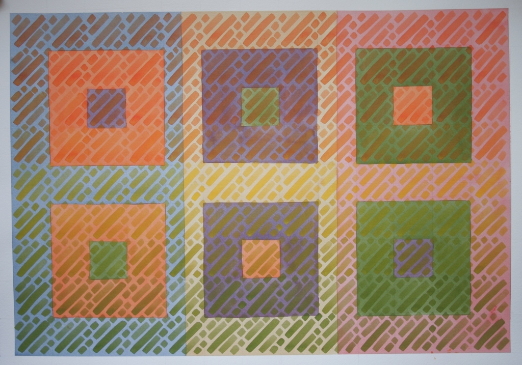
The same is applied to all of the paintings moving from either a tertiary colour to it’s two adjacent (on the colour wheel ) primary colours or from a primary to it’s adjacent tertiary colours.
Clearly there are numerous avenues to explore here. It is important to note that this is colour contrast according to watercolour with it’s limitations on the dark and light applications of paint. Hence the first and last paintings holding less initial visual impact as the lighter applications of paint are being applied last.
Comments are more than welcome to info@mjforster.com
To be continued.


